A CITIC Bank VIP customer redeems Starbucks through about ten app screens—a window into China’s dense bank-app UX.
Open almost any major Chinese app and you enter a familiar rhythm: ads before content, pop-ups before the task, benefits before redemption, risk controls before trust. Bank apps amplify this pattern. They are not only financial tools; they are benefit malls, installment desks, insurance shelves, and travel portals stacked into one dense interface. The denser the “super-app,” the longer the path from promise to payoff.
That stacking logic—ship every feature, insert every conversion, block every risk—is a useful window into China’s software and product culture. When a user wants one small thing, the system often wants ten larger ones.
A free coffee makes an unusually clear mirror.
A CITIC Bank VIP customer wanted to redeem a card benefit under 「365品质生活+」 (365 Quality Life+) for a Starbucks drink.
It sounded lovely. In practice, it took about ten steps.
Not ten steps across a café floor—ten screens inside the app. Splash ad, installment popup, benefits maze, terms, confirmation, a drag-and-drop captcha puzzle… and only then a QR code that refreshes every 30 seconds.
Good product design should start from the user’s point of view. A free coffee should not be this hard. After walking the path, one question sticks:
Is this a perk—or a torment?
What follows is the real path. Only UI that appears in the flow is described; nothing is invented.
Step 1: Watch an ad first
Open 动卡空间 (Dongka Space, CITIC’s card/benefits area) and hit a full-screen splash ad. The skip button is still counting down. Cards flash. The coffee is nowhere near.
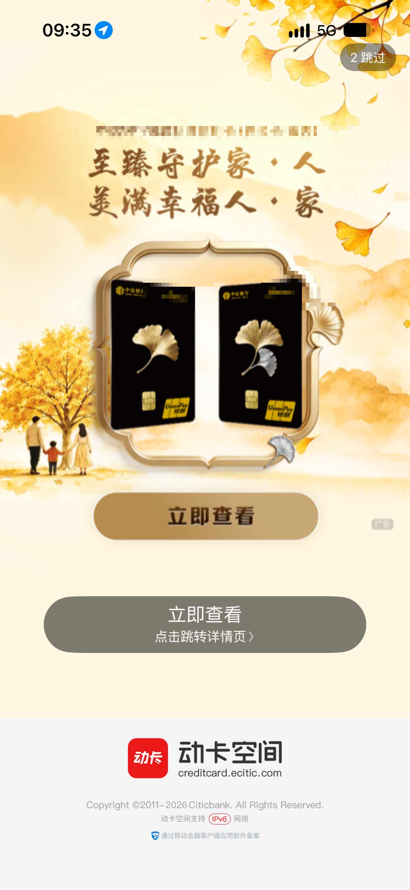
Figure 1|Boot with an ad. Coffee can wait.
In China’s app ecosystem, the splash ad is almost a door tax. Bank apps are no exception: impression metrics land first; user intent queues behind. Before you search for a benefit, the product has already booked an exposure.
Step 2: Then an installment popup
Reach the home screen and another gate appears: 「您有一笔账单可办理分期」—“You have a bill eligible for installment.” Amounts and interest discounts line up. A bright red 「立即办理」 (“Apply now”) button outshouts every benefits entrance.
Someone who came to redeem coffee is invited to finance a bill first.
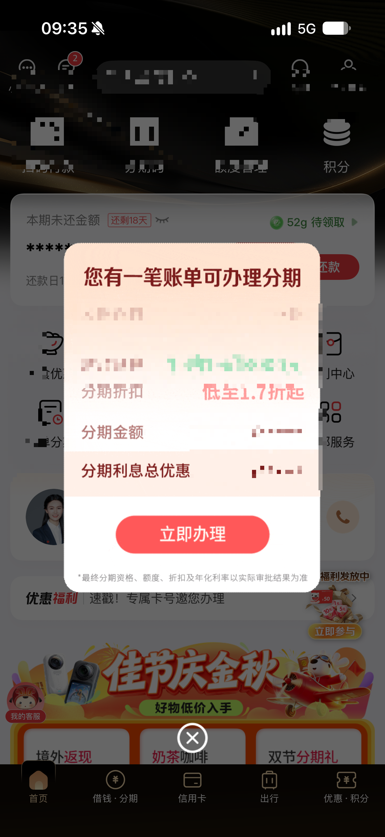
Figure 2|User wants a benefit; product wants installments. Priorities, clear.
分期 (fenqi)—installment or “buy now, pay later” style bill splitting—is a core conversion surface in Chinese banking and consumer-finance apps. The popup is not an accident; it is a KPI. Close it, and you finally start your own task. Leave it open, and you stand at the mouth of a conversion funnel.
Step 3: Enter the “My Benefits” maze
Dismiss the popup and find the benefits entrance. There are 28 card benefits. A sidebar lists categories: private care, business travel, insurance… Coffee hides in a thin line under 「365品质生活+」—“free redemption for Starbucks, Häagen-Dazs.”
Many benefits. A long path.
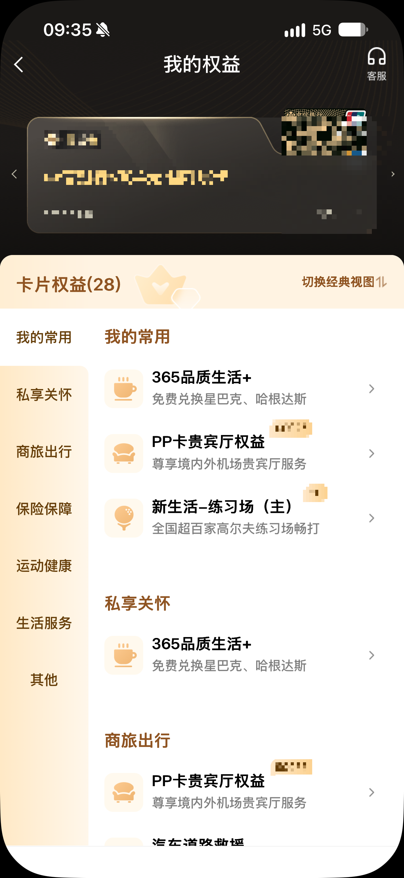
Figure 3|Finding one coffee among 28 benefits feels like opening a blind box.
Chinese bank VIP / card-benefit stacks are often warehouse-sized: neat categories, long inventories, polished copy. VIP customers see “I have a lot of perks.” Product teams see “the benefits matrix is complete.” The gap between having and using is navigation, taxonomy, fine print—and patience. (Tiers and eligibility vary by card and program; this piece does not invent deposit thresholds or wealth-management implications. The subject is simply a CITIC Bank VIP customer.)
Step 4: Reach the 365 Quality Life+ shelf
Tap in, and only then arrive at the actual “shelf”: Starbucks, Häagen-Dazs, Luckin, Costa—each with 「立即兑换」 (“Redeem now”). By this point, the user has already tapped four times.
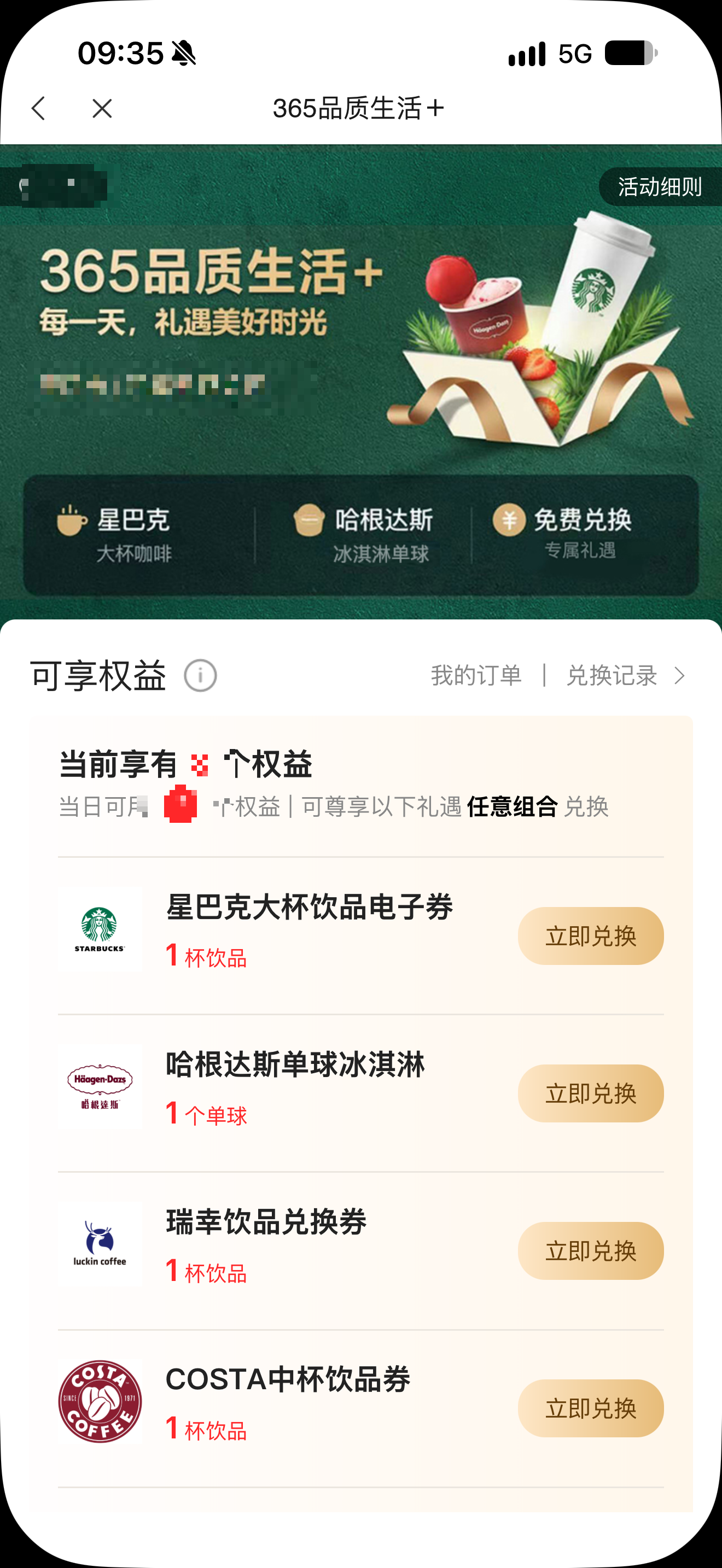
Figure 4|The shelf looks nice. The problem is the three doors in front of it.
The shelf itself is not ugly. What wears people down is the friction before it: ad, installment, maze. In Chinese super-apps, benefit shelves often look respectable. The real UX test is whether you need a ticket just to walk through the door.
Step 5: Terms longer than the coffee
Choose a Starbucks grande and open the detail page. 「使用须知」 (usage notes) lists unavailable stores: airports, some Reserve locations, special stores… A regular large cup comes with a geography appendix.
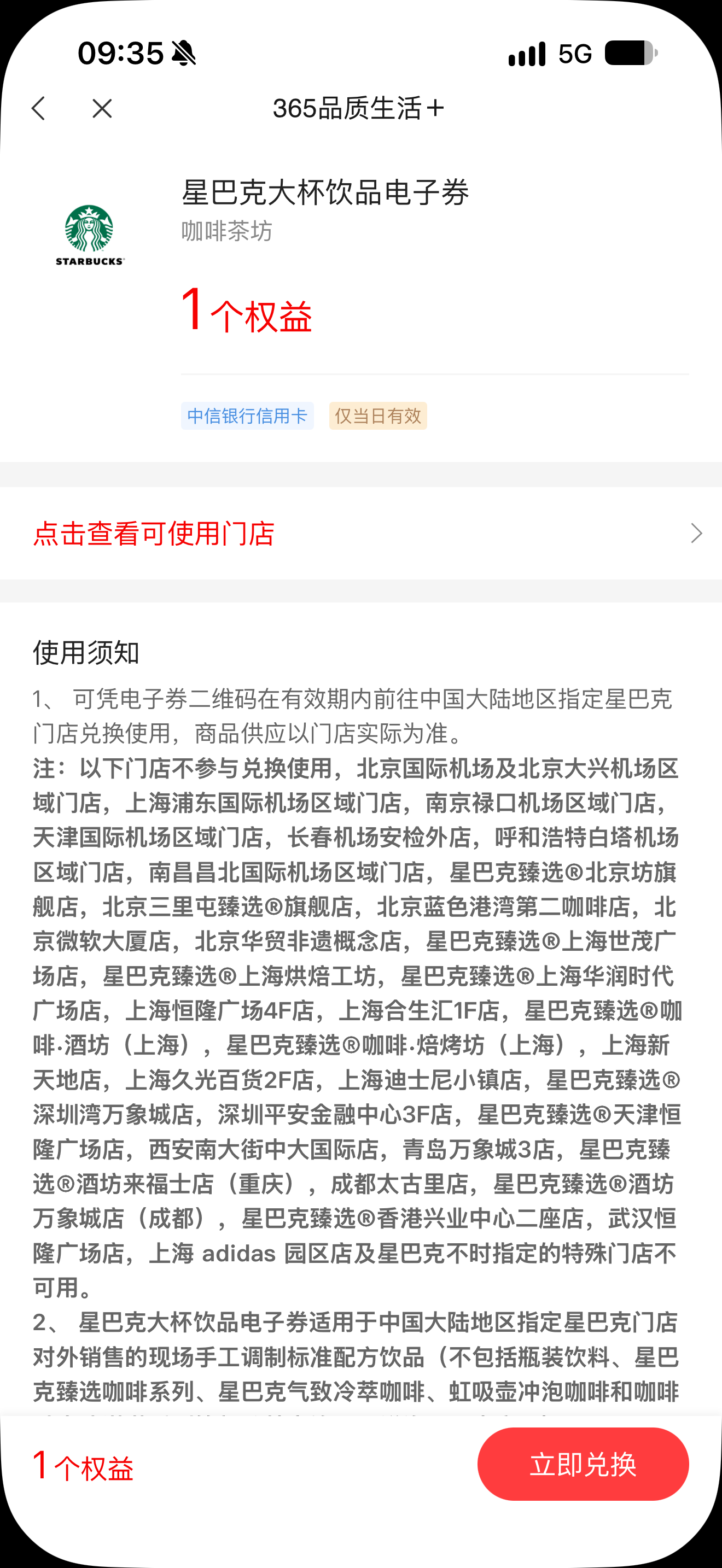
Figure 5|The price of “free” is written in the smallest type.
Terms matter: partnership boundaries, store exceptions, legal disclaimers. But when usage notes read like a travel guide, the feeling slides from “claiming a perk” to “reading a contract.” Free is not unconditional—and the conditions, though tiny on screen, dominate the experience.
Step 6: Confirm, then confirm again
Tap 「立即兑换」 and a dialog asks again: confirm using 1 benefit? Valid for the day only; no anytime refund / no expiry refund.
「我再想想」 (“Let me think”) sits beside 「我知道了」 (“Got it”). The system seems to assume users must be startled before they deserve the coffee.
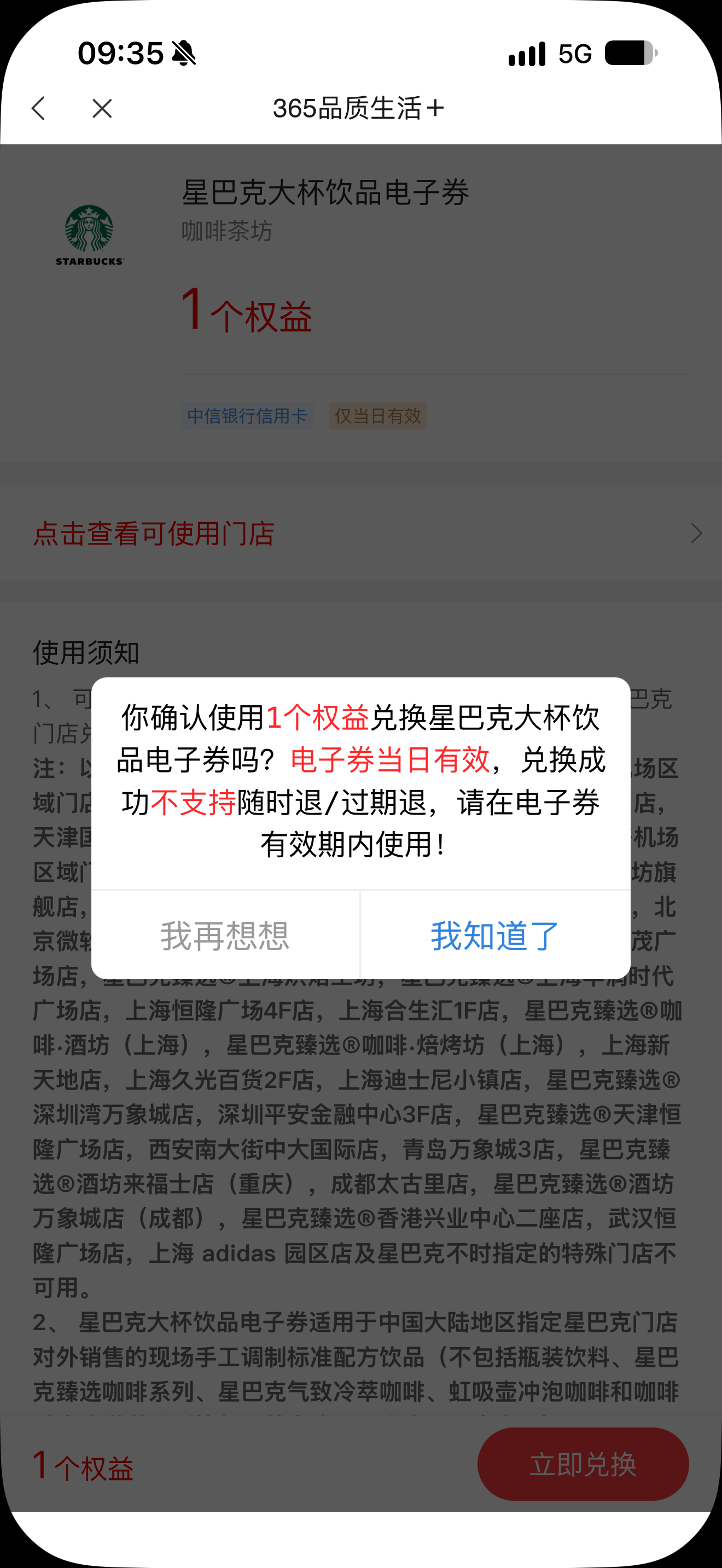
Figure 6|Afraid you’ll redeem too cheerfully.
Second confirmation is common in finance products—anti-mis-tap, anti-complaint, anti-ticket volume. When the warning’s emotional weight exceeds the action itself, users feel something else: the system neither trusts their decision nor wants them to finish gladly.
Step 7: Drag the slider to finish the puzzle
After confirm, GeeTest appears: 「请拖动滑块完成拼图」—“Please drag the slider to complete the puzzle.” To redeem a coffee, first prove you are human.
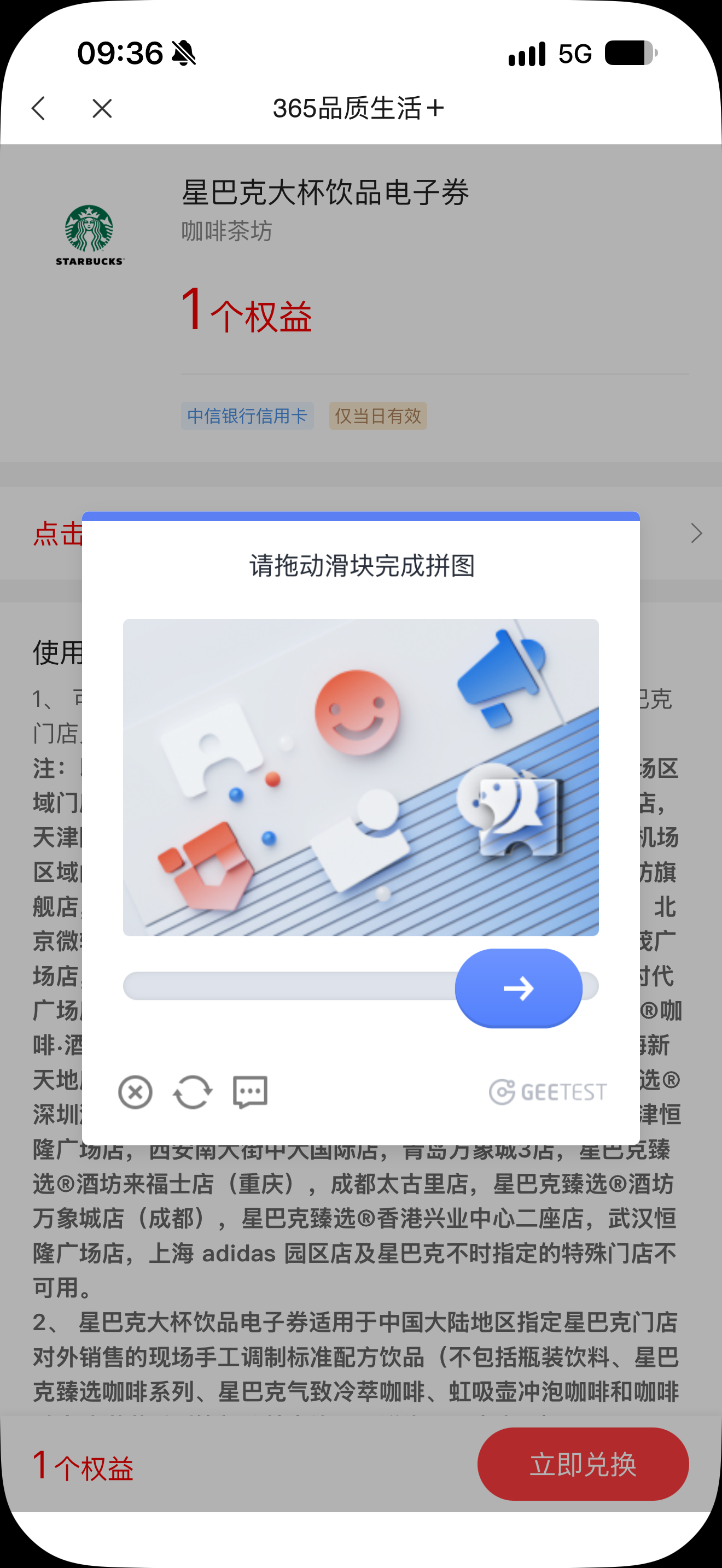
Figure 7|Risk control is diligent. Experience is exhausted.
GeeTest-style slider/puzzle captchas are ubiquitous in Chinese apps—an airport security line shared by bots (“wool parties” farming benefits) and ordinary people. Risk has a case: benefits can be scripted at scale. Users have a case: they only want Starbucks. When both are right, experience usually loses.
Step 8: Congrats—you’re faster than 97% of users
Puzzle passed. A message celebrates: 1.9 seconds, faster than 97% of users. The checkpoint even has a leaderboard.
The user did not win. They only tapped again.
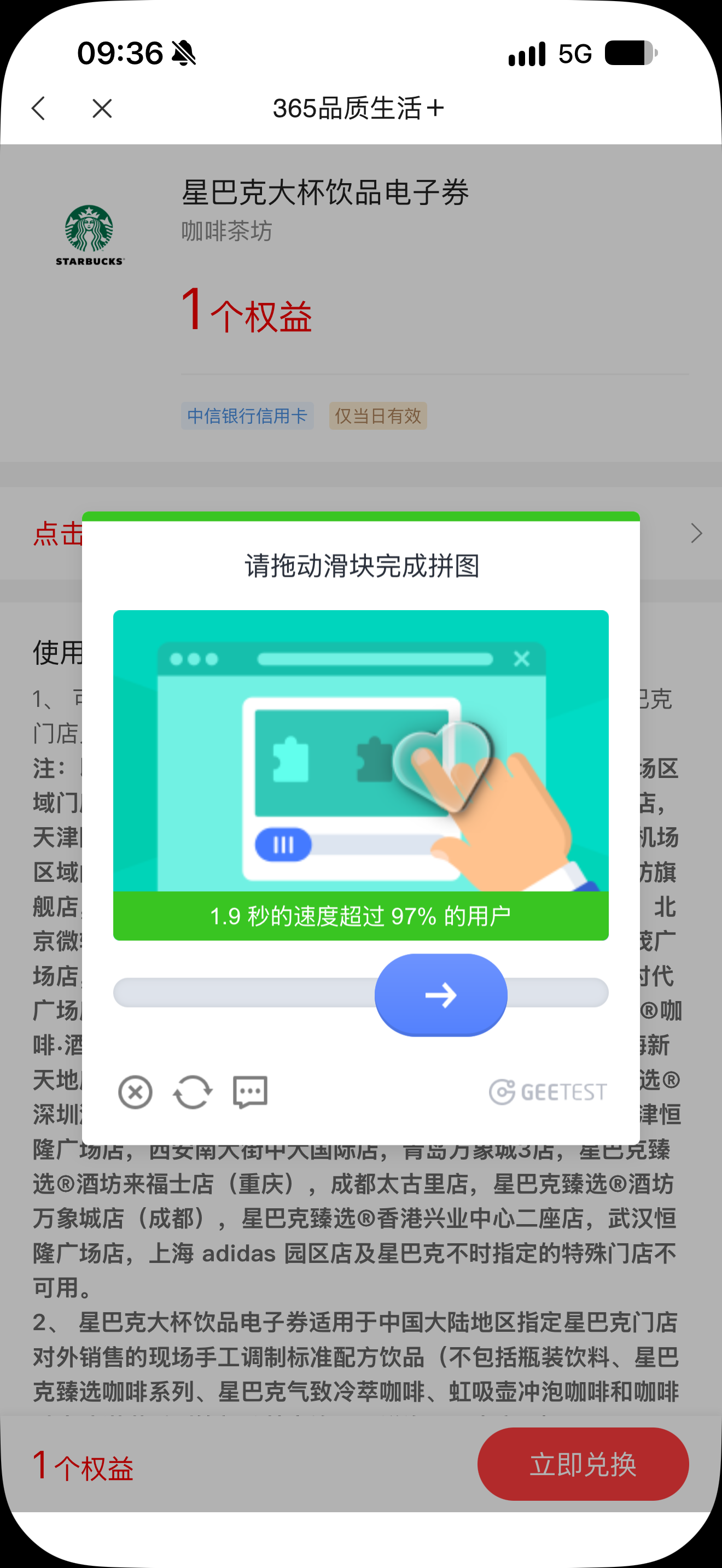
Figure 8|The system awards a banner. Coffee is still on the next page.
Turning verification into a speed contest is a familiar Chinese micro-interaction: wrap friction in a badge of achievement. You’re faster than 97%—and then? The coffee is still one screen away. The badge does not shorten the path; it only makes the path slightly less embarrassing.
Step 9: Redemption request submitted
A green check appears: 「兑换请求已提交」—“Redemption request submitted.” Still no drink. Still need to tap 「立即使用」 (“Use now”).
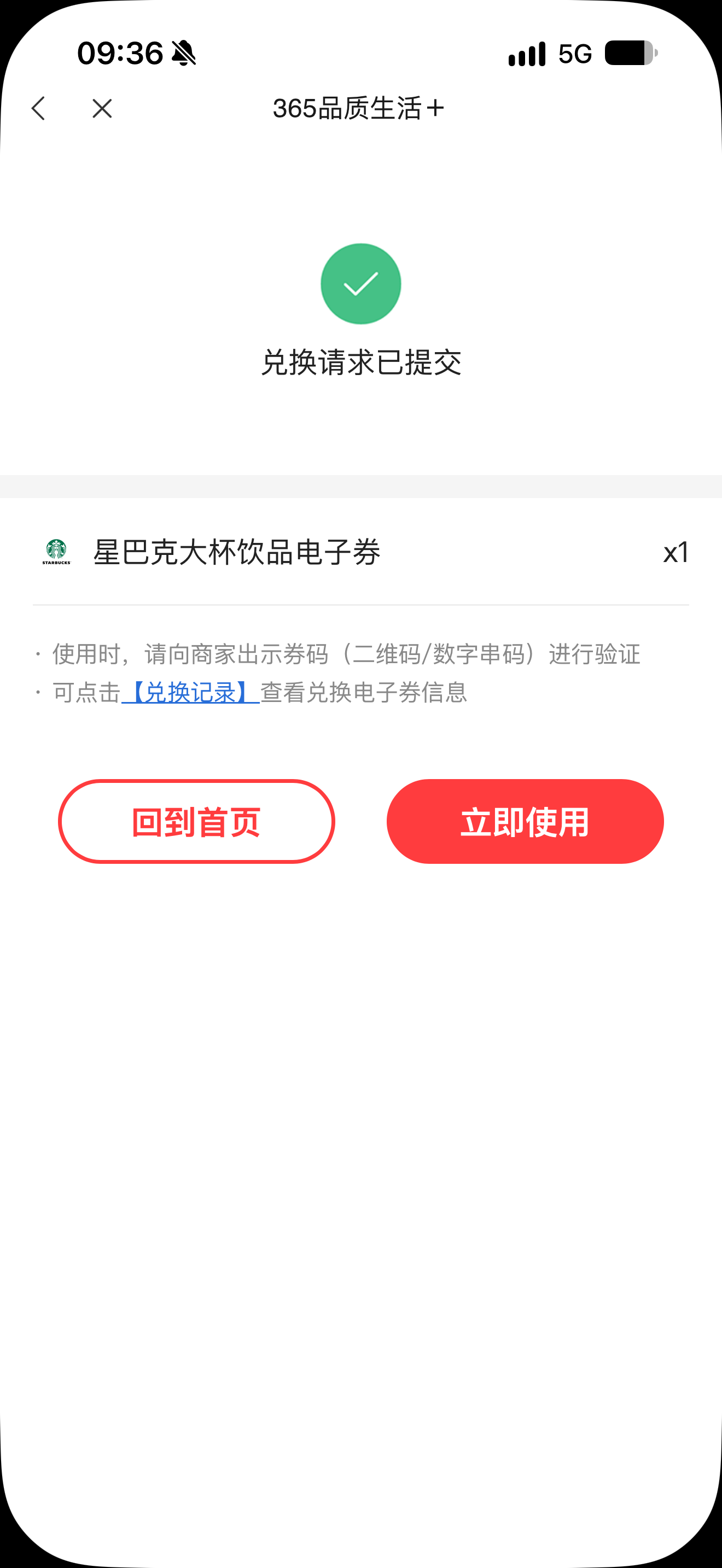
Figure 9|Success? One last mile remains.
“Submitted” is not “ready to use.” In benefits flows, submit / generate / present are often split across screens—each justified (audit trail, state machine, redemption prep), together feeling like the finish line was moved another kilometer back.
Step 10: QR code, refresh every 30 seconds
Finally, the voucher screen. The QR code refreshes every 0.5 minutes—a 30-second countdown. Red text instructs Starbucks partners: please redeem via the “scan to redeem” button on the POS.
Valid for the day only.
After ten steps, you stand at the counter while the screen keeps ticking.
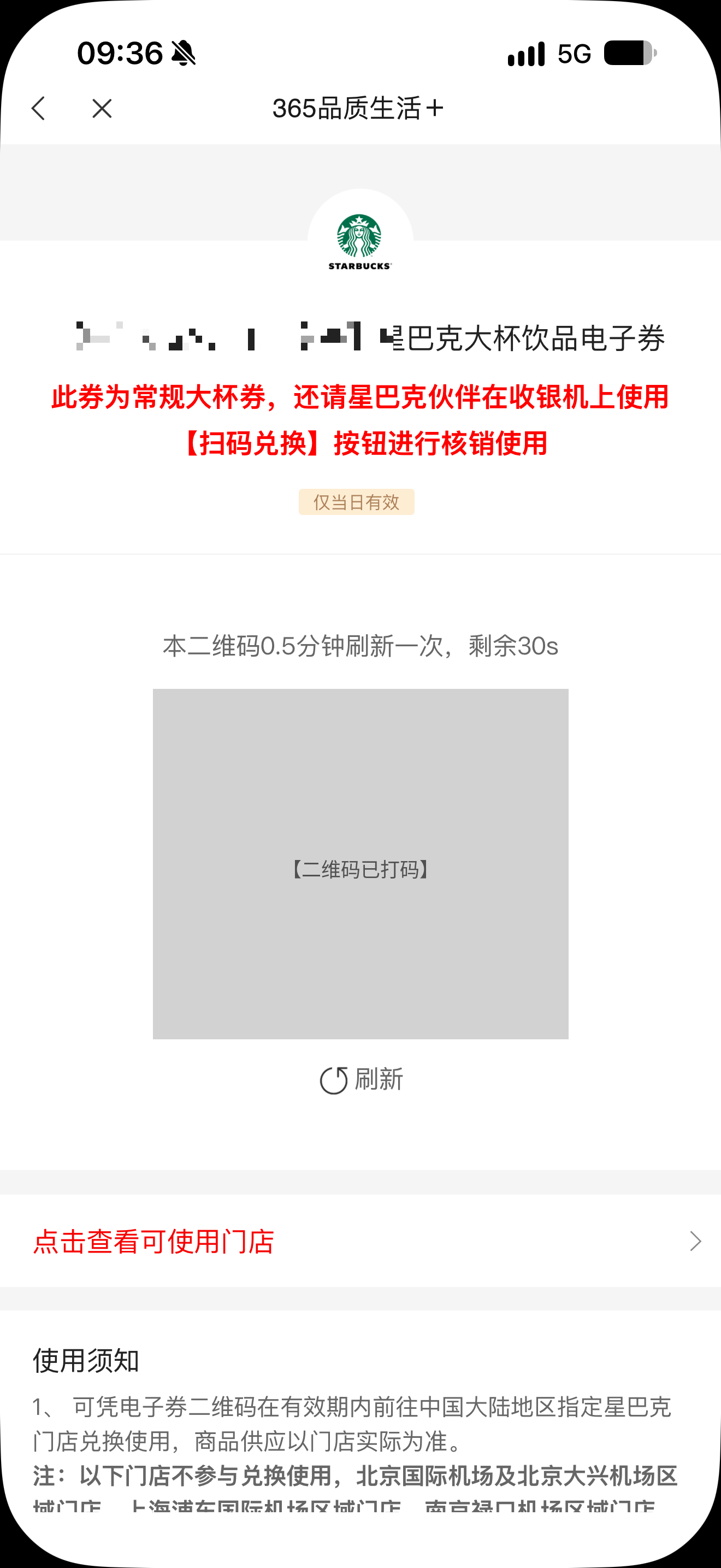
Figure 10|You’ve arrived. Sweaty palms—caffeine anticipation, or countdown anxiety?
A 30-second refresh is classic anti-fraud design in China: screenshot forwarding, remote proxy redemption, code reuse all need pressure. The risk logic holds. So does the user experience of staring at a countdown in a Starbucks line. The end of a perk often arrives with a little timer anxiety.
What were the product managers thinking?
After this route, it is hard to believe the flow was built from a user’s point of view.
It looks more like: splash needs exposure; home needs installment conversion; benefits need full inventory; terms need legal cover; confirmation needs complaint prevention; captcha needs anti-arbitrage; submit needs an audit trail; QR needs anti-theft—each link “makes sense,” and the chain is ruthless to the person holding the phone.
That combination is a miniature of product culture in large Chinese apps—especially banks and platform-style super-apps:
- Density first: more features, benefits, and entries look more “complete.”
- Conversion first: ads and installment popups sit ahead of the user’s actual task.
- Risk first: wool farming, stolen codes, and complaints each justify their own gate.
- Diffused ownership: growth owns exposure, credit owns installments, legal owns fine print, risk owns captcha, ops owns redemption—and nobody owns “ten steps.”
Two explanations, not mutually exclusive:
- Craft is missing—teams can stack features but not subtract; can block risk but not protect experience.
- Craft exists, but follows leadership—KPIs are exposure, installments, loss prevention on redemption—not “does the user feel good.”
And leadership mostly does not use its own product day to day. If executives had to redeem this coffee themselves, after ten screens they might switch banks—or switch the person accountable for the product.
VIP customers do not need a thicker benefits brochure. They need a shorter path. A free coffee can be goodwill, or an obstacle course. The difference is whether the people building the product ever put themselves in the shoes of the person who just wants to drink it.
Closing: between perk and torment
A CITIC Bank VIP customer traded ten screens for a same-day grande voucher.
The flow ends. The question does not:
Perk—or torment?
The answer is not on the marketing poster. It sits in the Step-2 installment popup you must dismiss, in the Step-7 puzzle, in the Step-10 thirty-second countdown still ticking.
China’s software and mobile UX is often not “one wrong button.” It is an incentive structure: exposure, conversion, loss prevention, audit trails—each locally rational, together charging the user a cost outside the brochure—attention, patience, time, and a little doubt about what “benefit” means.
A coffee should taste sweet. After ten steps, you learn: sweetness depends on how short the path is—and path length depends on whether product people ever stand where the thirsty customer stands.
(Figures are process illustrations with personal and financial identifiers masked. Image files may sit beside the article as step-01.png … step-10.png, or be referenced as “see figure.”)